Interactive correlation plot
Correlation figure is very useful to show correlation for all variables in a data frame. There are several ways to draw a correlation plot in R. This post is to show how to create correlation plots and interactive plot in Rmarkdown.
Load all required libraries.
library(ggplot2)
library(corrplot)
library(ggiraph)
library(tidyverse)
Basic plot function
The plot function in basic R can be used to plot correlation in a data frame (e.g. the dataset longley). However this method is not suitable to view a table with lots of columns.
plot(longley)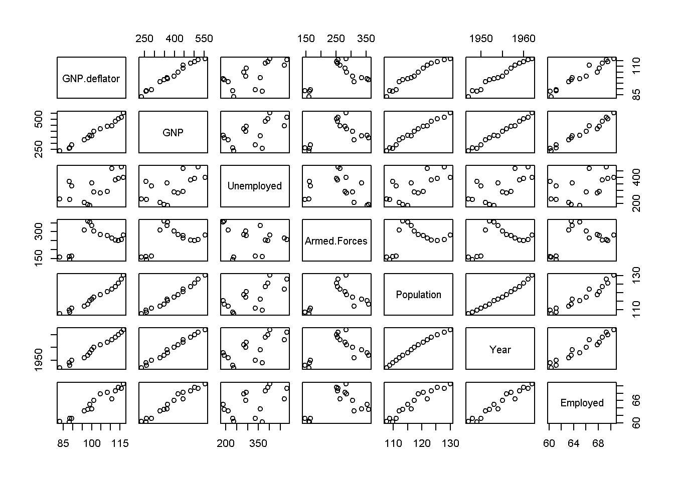
corrplot package
corrplot package can be used to draw a static correlation figure for a data frame. However, the scatter plots are not plotted for each pair of variables and it is hard to understand the real correlation.
cor(longley) %>%
  corrplot()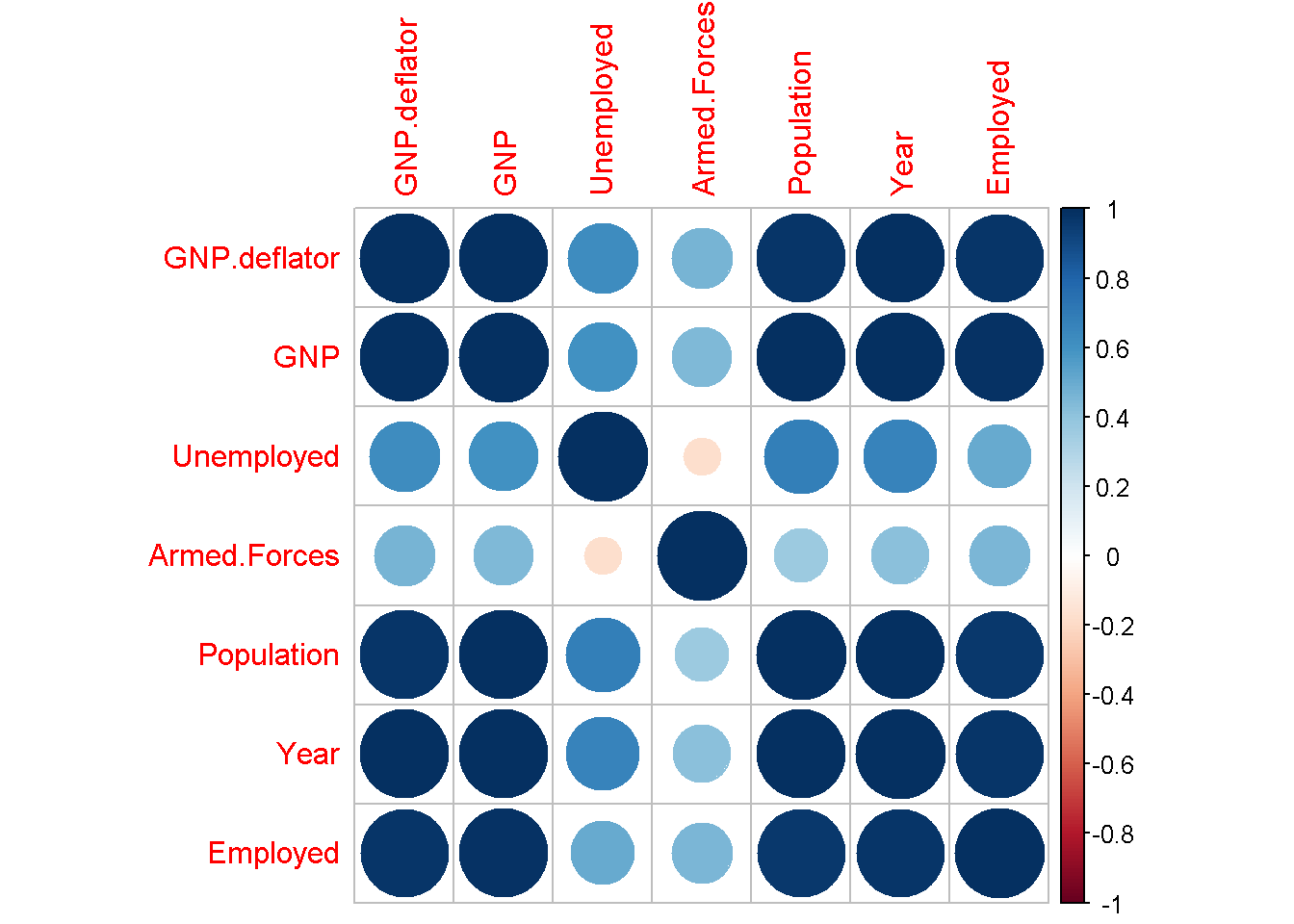
Interactive figure using ggiraph
ggiraph package can convert a ggplot into interactive figure. A ggplot2 figure is created for the correlation. It is possible to show the scatter plot when click on the correlation map.
# Calculate the correlation and obtain the lower triangle
pd <- cor(longley)
pd[upper.tri(pd)] <- NA
pd <- reshape2::melt(pd, na.rm = TRUE)

colors = c("blue", "white", "red")

# Create ggplot2
p1 <- ggplot(pd) +
  geom_tile(aes(Var1, Var2, fill = value), color = "gray")  +
  scale_fill_gradient2(low = colors[1], high = colors[3],
                       mid = colors[2], midpoint = 0, limit = c(-1, 1), space = "Lab",
                       name = "Corr") +
  geom_text(mapping = aes(x = Var1, y = Var2, label = round(value, 1)), size = 2) +
  ggplot2::coord_fixed() +
  theme_minimal() +
  theme(axis.text.x = element_text(angle = 45,
                                   vjust = 1, size = 8, hjust = 1),
        axis.text.y = element_text(size = 8),
        legend.position = 'bottom') +
  guides(fill = FALSE) +
#  guides(fill = guide_colorbar(title = NULL, barwidth = unit(0.6, "npc"))) +
  xlab("") + ylab("")
p1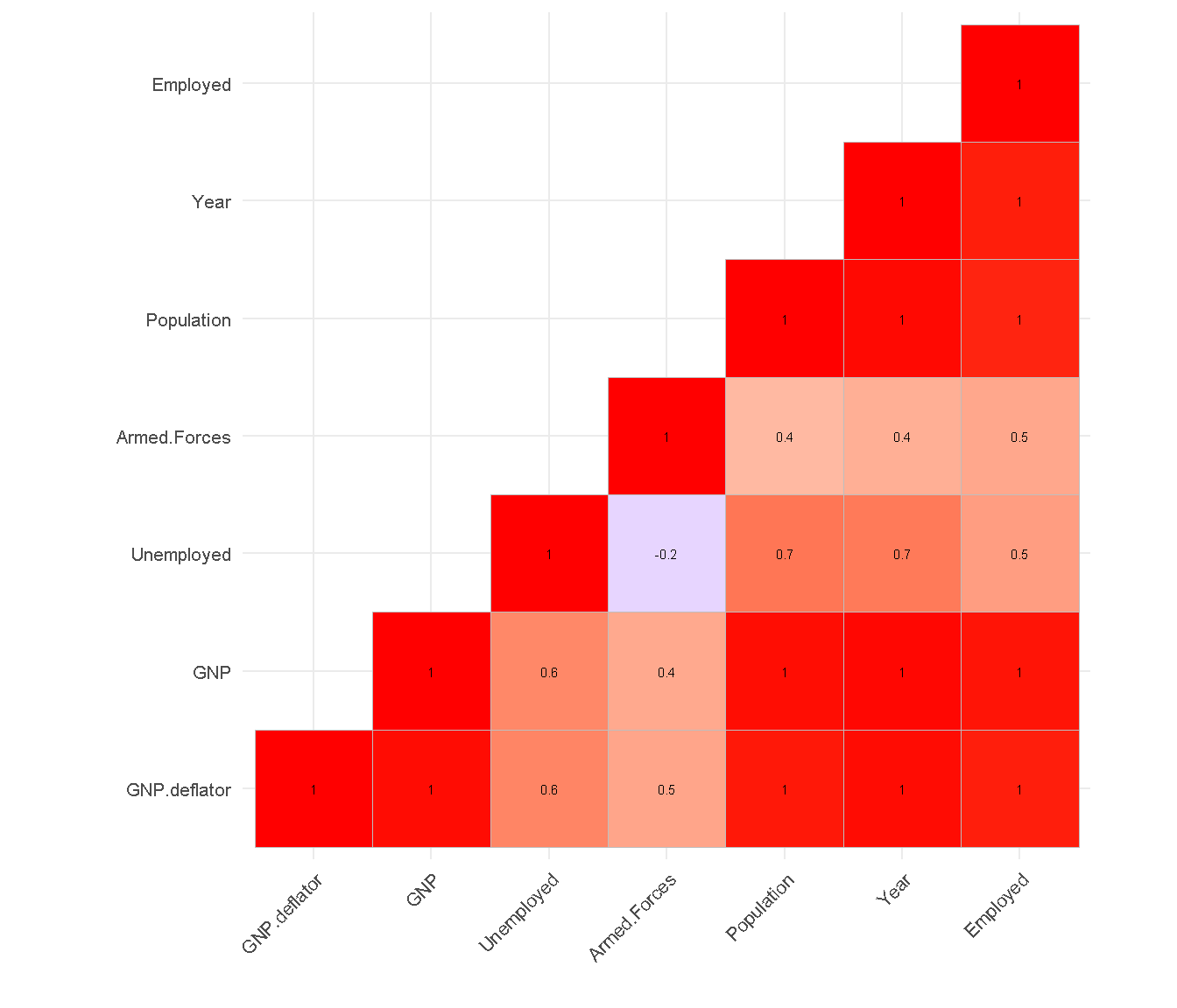
In the next step, the interactive figure is created through adding new columns data_id and tooltip.
pd2 <- pd %>%
  mutate(data_id = paste0(Var1, '-', Var2),
         tooltip = paste0(Var1, '-', Var2, ': ', round(value, 2)))
p2 <- ggplot(pd2) +
  geom_tile_interactive(aes(Var1, Var2, fill = value,
                            tooltip = tooltip
                            ), color = "gray")  +
  scale_fill_gradient2(low = colors[1], high = colors[3],
                       mid = colors[2], midpoint = 0, limit = c(-1, 1), space = "Lab",
                       name = "Corr") +
  geom_text(mapping = aes(x = Var1, y = Var2, label = round(value, 1)), size = 2) +
  ggplot2::coord_fixed() +
  theme_minimal() +
  theme(axis.text.x = element_text(angle = 45,
                                   vjust = 1, size = 8, hjust = 1),
        axis.text.y = element_text(size = 8),
        legend.position = 'bottom') +
  guides(fill = FALSE) +
#  guides(fill = guide_colorbar(title = NULL, barwidth = unit(0.6, "npc"))) +
  xlab("") + ylab("")
girafe(ggobj = p2)
The onclick event can be added for each grid to show the scatter plot through calling the js script. A js function create_fig is defined to use d3.js to draw a scatter plot.
knitr::raw_html('
<script type="text/javascript">

var create_fig = function(valuex, valuey, xlabel, ylabel) {
  var margin = {top: 10, right: 30, bottom: 50, left: 70},
  width = 460 - margin.left - margin.right,
  height = 400 - margin.top - margin.bottom;

  // Remove old plot
  var svg1 = d3.select("#comparison-plot");
  svg1.selectAll("*").remove();
  // append the svg object to the body of the page

  var svg = d3.select("#comparison-plot")
    .append("svg")
      .attr("width", width + margin.left + margin.right)
      .attr("height", height + margin.top + margin.bottom)
    .append("g")
      .attr("transform",
            "translate(" + margin.left + "," + margin.top + ")");

  // Add X axis
  var x = d3.scaleLinear()
    .domain([Math.min(...valuex), Math.max(...valuex)])
    .range([ 0, width ]);
  svg.append("g")
    .attr("transform", "translate(0," + height + ")")
    .call(d3.axisBottom(x));
  svg.append("text")
    .attr("class", "x label")
    .attr("text-anchor", "end")
    .attr("x", margin.left + width / 2)
    .attr("y", margin.top + height + 30)
    .text(xlabel);
  // Add Y axis
  var y = d3.scaleLinear()
    .domain([Math.min(...valuey), Math.max(...valuey)])
    .range([ height, 0]);
  svg.append("text")
    .attr("class", "y label")
    .attr("text-anchor", "end")
    .attr("y", -50)
    .attr("x", -(height / 2) + margin.top)
    .attr("transform", "rotate(-90)")
    .text(ylabel);
  svg.append("g")
    .call(d3.axisLeft(y));
  // Create data item
  var data = valuex.map((item, i) => ({x:item, y:valuey[i]}))
  // Add dots
  svg.append("g")
    .selectAll("dot")
    .data(data)
    .enter()
    .append("circle")
      .attr("cx", function (d) { return x(d.x); } )
      .attr("cy", function (d) { return y(d.y); } )
      .attr("r", 4)
      .style("fill", "#69b3a2")

  }
</script>
')
The js is created to response the onclick event.
# Generate js to create_fig
generate_js <- function(df) {

  x <- longley[[df$Var1]]
  y <- longley[[df$Var2]]
  df$onclick <- paste0("create_fig(",
         jsonlite::toJSON(x), ", ",
         jsonlite::toJSON(y), ", ",
         '"', df$Var1, '", ',
         '"', df$Var2, '"',
         ")")
  df
}
# Create a new data frame
pd3 <- pd2 %>%
  group_by(Var1, Var2) %>%
  do(generate_js(.))

p3 <- ggplot(pd3) +
  geom_tile_interactive(aes(Var1, Var2, fill = value,
                            tooltip = tooltip,
                            data_id = data_id,
                            onclick = onclick
                            ), color = "gray")  +
  scale_fill_gradient2(low = colors[1], high = colors[3],
                       mid = colors[2], midpoint = 0, limit = c(-1, 1), space = "Lab",
                       name = "Corr") +
  geom_text(mapping = aes(x = Var1, y = Var2, label = round(value, 1)), size = 2) +
  ggplot2::coord_fixed() +
  theme_minimal() +
  theme(axis.text.x = element_text(angle = 45,
                                   vjust = 1, size = 8, hjust = 1),
        axis.text.y = element_text(size = 8),
        legend.position = 'bottom') +
  guides(fill = FALSE) +
#  guides(fill = guide_colorbar(title = NULL, barwidth = unit(0.6, "npc"))) +
  xlab("") + ylab("")
girafe(ggobj = p3)
A new div element is added at the bottom of interactive figure to show the scatter plot.
knitr::raw_html('<div id="comparison-plot"></div>')Bangyou Zheng
Data Scientist / Digital Agronomist
a research scientist of digital agriculture at the CSIRO.